My thesis at NYU is a generative art installation that uses algorithms modeled after organic growth to draw paintings.
I also run a solo web design and development practice. Currently building fictional UIs for an indie horror film.
- PROJECTS + CLIENTS
- La Cima Charter School
- IDM@NYU Senior Project
- Finn Crawford
- Hunter Mathews
- Jenna Ferayo
- FORTH
- Redesigning Nutrition Facts
- Photography
Redesigning FDA’s Nutrition Facts
Introduction
For my final project in NYU's User Experience course, I researched and redesigned the FDA's Nutrition Facts label — and proposed a companion digital tool to extend what a physical label alone can't do.
The Problem
Diet-related chronic diseases — cardiovascular disease, diabetes, obesity — are among the most preventable health crises in the U.S., and they fall hardest on racial and ethnic minority groups, lower-income communities, and people in rural areas. The Nutrition Facts label is the FDA's primary tool for helping Americans make better food choices. But for many people, it isn't working. The information is there; the legibility and accessibility aren't.
Research
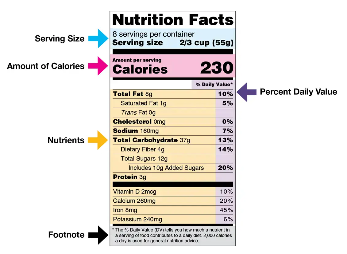
I structured my research around four questions: What does the current label actually measure, and why does it matter? What do nutritionists recommend beyond what the FDA requires? How do real consumers interact with the label today? And where does it lose them? To answer the last two, I conducted in-person interviews with friends and family and ran a short survey measuring how frequently people use the label, which sections they actually read, and which parts they find confusing or ignore entirely. The interviews surfaced something consistent: people wanted a single, at-a-glance signal for food quality — something that didn't require them to decode percentages and daily values on the spot.
The Solution
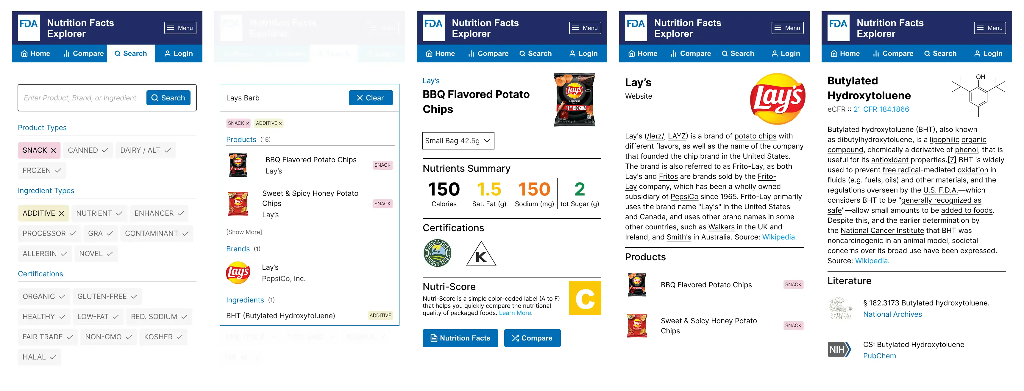
That insight drove both parts of my design. A redesigned label. I incorporated Nutri-Score — a front-of-pack grading system developed in the EU that converts a product's nutritional profile into a letter grade and color rating — into a revised FDA label. I chose Nutri-Score because it's the most research-backed simplified grading system in wide use, and because a letter-plus-color system works across languages and literacy levels. I paired it with color-coded indicators for key nutrients so consumers can understand why a product received its grade, not just what the grade is.
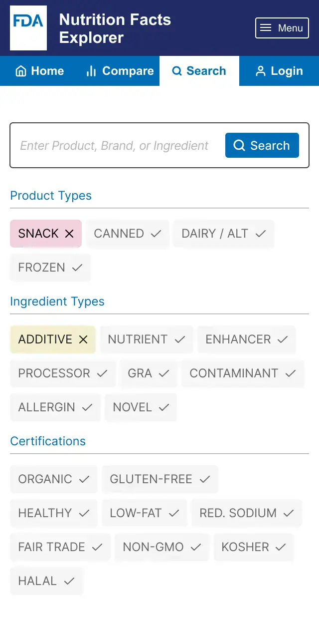
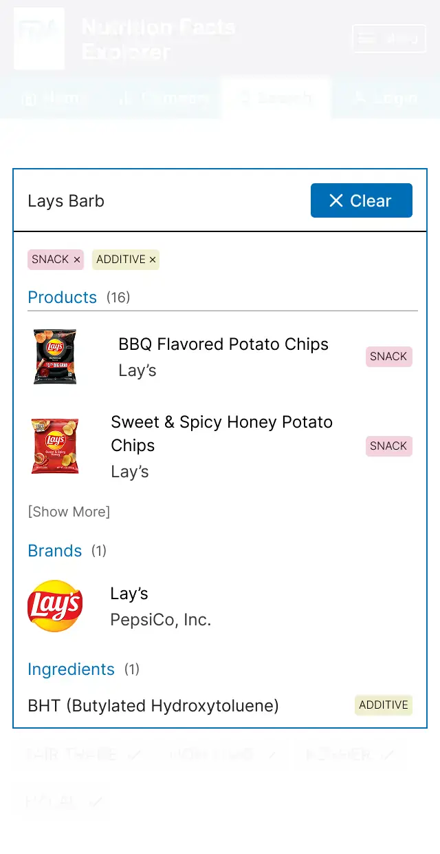
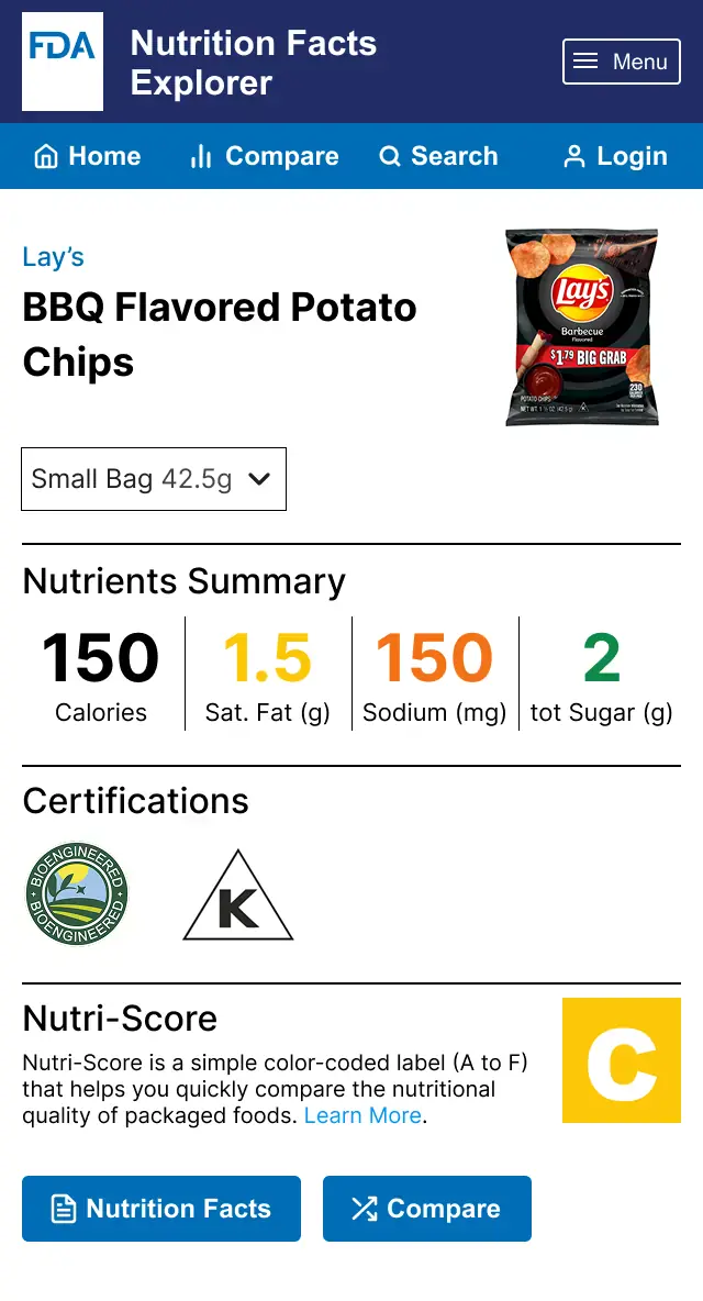
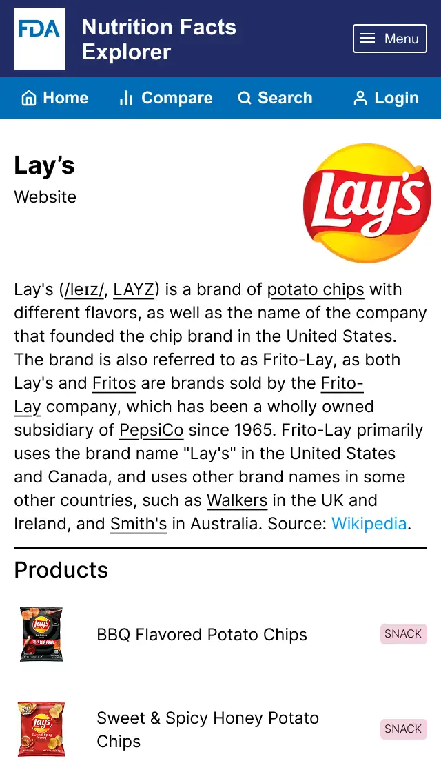
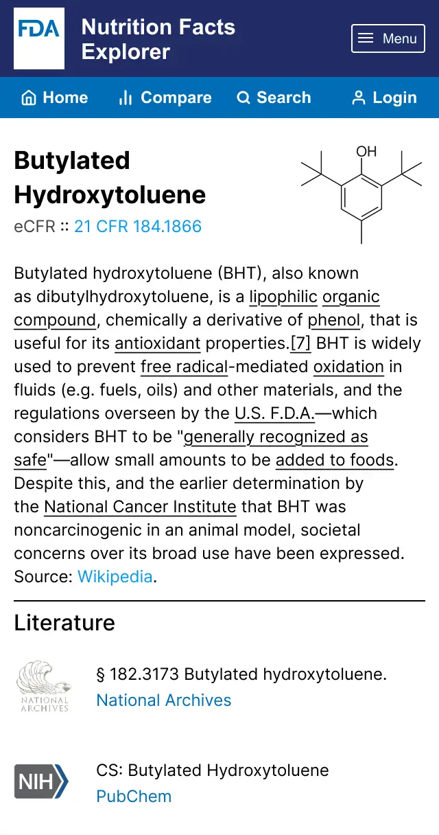
A digital companion tool. A physical label has hard limits — there's only so much that fits. The FDA likely already maintains nutritional data on nearly every product sold in the U.S.; my proposal imagines making that database publicly accessible through a web application with search, filtering, and product comparison features. Individual ingredient pages would link to relevant literature and the National Archives database, giving curious consumers a path to go deeper. A private-sector version of this already exists — SmartLabel has partnered with roughly 80 companies to do something similar — but there's no reason the FDA couldn't offer this natively.
Reflection
This project pushed me to design for a genuinely underserved audience and to think carefully about what "accessible" means when your users span every age, income level, language, and health literacy. The most important design decision wasn't visual — it was choosing to prioritize a single legible signal over a more comprehensive but harder-to-parse label. Sometimes the right call is to show less.
Redesigning FDA’s Nutrition Facts
Introduction
For my final project in NYU's User Experience course, I researched and redesigned the FDA's Nutrition Facts label — and proposed a companion digital tool to extend what a physical label alone can't do.
The Problem
Diet-related chronic diseases — cardiovascular disease, diabetes, obesity — are among the most preventable health crises in the U.S., and they fall hardest on racial and ethnic minority groups, lower-income communities, and people in rural areas. The Nutrition Facts label is the FDA's primary tool for helping Americans make better food choices. But for many people, it isn't working. The information is there; the legibility and accessibility aren't.
Research
I structured my research around four questions: What does the current label actually measure, and why does it matter? What do nutritionists recommend beyond what the FDA requires? How do real consumers interact with the label today? And where does it lose them? To answer the last two, I conducted in-person interviews with friends and family and ran a short survey measuring how frequently people use the label, which sections they actually read, and which parts they find confusing or ignore entirely. The interviews surfaced something consistent: people wanted a single, at-a-glance signal for food quality — something that didn't require them to decode percentages and daily values on the spot.
The Solution
That insight drove both parts of my design. A redesigned label. I incorporated Nutri-Score — a front-of-pack grading system developed in the EU that converts a product's nutritional profile into a letter grade and color rating — into a revised FDA label. I chose Nutri-Score because it's the most research-backed simplified grading system in wide use, and because a letter-plus-color system works across languages and literacy levels. I paired it with color-coded indicators for key nutrients so consumers can understand why a product received its grade, not just what the grade is.
A digital companion tool. A physical label has hard limits — there's only so much that fits. The FDA likely already maintains nutritional data on nearly every product sold in the U.S.; my proposal imagines making that database publicly accessible through a web application with search, filtering, and product comparison features. Individual ingredient pages would link to relevant literature and the National Archives database, giving curious consumers a path to go deeper. A private-sector version of this already exists — SmartLabel has partnered with roughly 80 companies to do something similar — but there's no reason the FDA couldn't offer this natively.
Reflection
This project pushed me to design for a genuinely underserved audience and to think carefully about what "accessible" means when your users span every age, income level, language, and health literacy. The most important design decision wasn't visual — it was choosing to prioritize a single legible signal over a more comprehensive but harder-to-parse label. Sometimes the right call is to show less.