Demo 2
Several problems arose with my original project. For one thing, writing a paper would be a difficult thing to pile on at the end of my senior year, even though I wanted to investigate the topic of wealth inequality and expertocracy, it simply wasn't possible in a reasonable amount of time. The other issue had to do with the nature of data visualization and the data I would've been working with. I wanted to compare various figures over time like the average cost of a 4 year degree, livable wages, median salary in the U.S., high school and college mean salaries. The best illustration of my arguement would've been a very formal presentation of writing and graphs comparing these relationships-- it would've been very formal, almost like a NYTimes article. This would've gone completely off topic from the rest of the class. I tried to think of ways to converge the data into one terrific data sculpture (like Nathalie Miebach's weather sculptures) to bring the "media art" aspect back into the fold, but nothing I found online or through my artist research indicated that this was the most effective representation of my topic.
Pivoting
Maybe if I dug a little deeper I could've found a solution for my previous proposal, but I've decided to cut my loses and transform my project entirely. Here is the new direction, I'm tentatively calling it Night Shift.

Frame Differencing
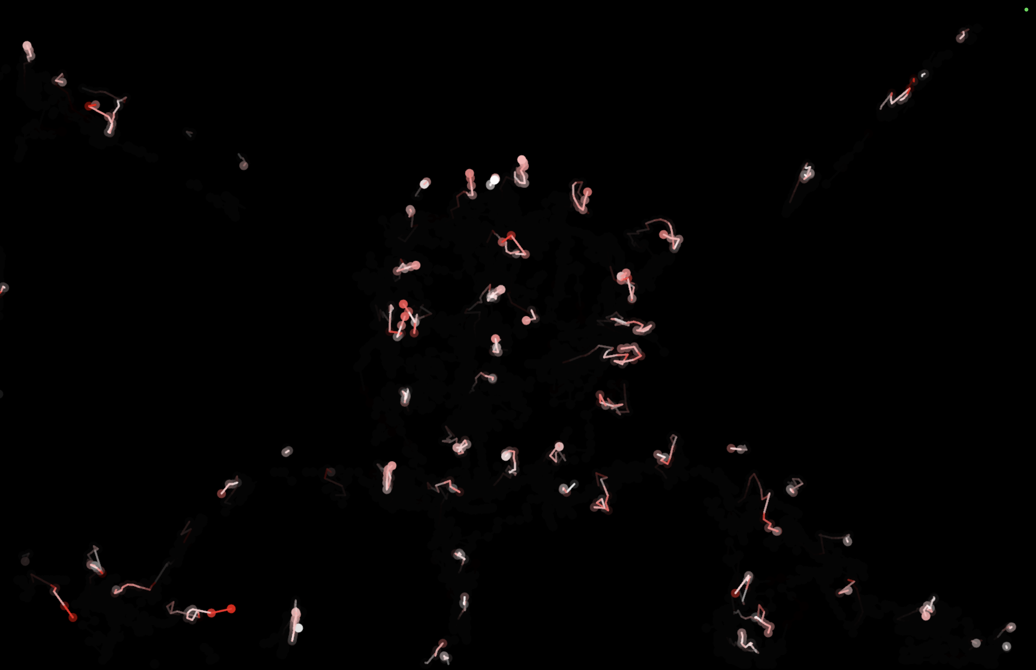
A camera takes a photo of the empty environment and a p5.js program calculates the difference between the original image and the latest updated frame. Positions are plotted live on a digital screen, higher speeds are represented with red coloring and decaying trails are drawn to show movement. I was inspired by the way Aaron Koblin manipulates flight data to create his Flight Patterns. I thought it would be interesting to manipulate a local dataset, like using the movement of people in a room.
References
- I'm using a motion detection script by Federico Sandri as a starting place (He's Italian so I can't read his notes) https://editor.p5js.org/federicoSandri/sketches/6ao5Ou7S7
- There is also a guide for a "motion heatmap" which isn't exactly what I need but I salvaged some useful code from there aswell. https://medium.com/@jules.docx/motion-heatmap-in-javascript-p5js-fa545233968a
Demo 2
Several problems arose with my original project. For one thing, writing a paper would be a difficult thing to pile on at the end of my senior year, even though I wanted to investigate the topic of wealth inequality and expertocracy, it simply wasn't possible in a reasonable amount of time. The other issue had to do with the nature of data visualization and the data I would've been working with. I wanted to compare various figures over time like the average cost of a 4 year degree, livable wages, median salary in the U.S., high school and college mean salaries. The best illustration of my arguement would've been a very formal presentation of writing and graphs comparing these relationships-- it would've been very formal, almost like a NYTimes article. This would've gone completely off topic from the rest of the class. I tried to think of ways to converge the data into one terrific data sculpture (like Nathalie Miebach's weather sculptures) to bring the "media art" aspect back into the fold, but nothing I found online or through my artist research indicated that this was the most effective representation of my topic.
Pivoting
Maybe if I dug a little deeper I could've found a solution for my previous proposal, but I've decided to cut my loses and transform my project entirely. Here is the new direction, I'm tentatively calling it Night Shift.

Frame Differencing
A camera takes a photo of the empty environment and a p5.js program calculates the difference between the original image and the latest updated frame. Positions are plotted live on a digital screen, higher speeds are represented with red coloring and decaying trails are drawn to show movement. I was inspired by the way Aaron Koblin manipulates flight data to create his Flight Patterns. I thought it would be interesting to manipulate a local dataset, like using the movement of people in a room.
References
- I'm using a motion detection script by Federico Sandri as a starting place (He's Italian so I can't read his notes) https://editor.p5js.org/federicoSandri/sketches/6ao5Ou7S7
- There is also a guide for a "motion heatmap" which isn't exactly what I need but I salvaged some useful code from there aswell. https://medium.com/@jules.docx/motion-heatmap-in-javascript-p5js-fa545233968a